Happitold is a custom display typeface developed to explore how personality, legibility, and structural consistency can coexist within a highly stylized letterset. The project began as a logotype for the hiking podcast Hiker Hobble and expanded into a broader type design study, allowing the original lettering logic to be tested across a full alphabet, punctuation set, specimen materials, and promotional applications. Rather than functioning as a neutral text face, the typeface is designed for headline use, where its softened geometry, angled joins, and weighted terminals create a distinctly informal and approachable voice.
The project demonstrates an emphasis on formal control within expressive typographic form. Across the specimen pages, the letterforms are presented through alphabet testing, feature callouts, and word-set proofs that examine rhythm, spacing, and consistency across repeated structures. The accompanying applications show how the typeface can operate beyond isolated glyph design, moving into identity, branding, and promotional communication. As a portfolio project, Happitold positions type design as both a formal investigation and a communication system, showing how custom letterforms can shape tone, hierarchy, and visual coherence across media.
Methods / Process Statement
Designed and digitally constructed using vector-based tools. The typeface was developed through iterative refinement of stroke structure, terminal treatment, internal spacing, and display-scale testing, then evaluated through specimen layouts and applied branding studies to assess consistency across contexts.
Designed and digitally constructed using vector-based tools. The typeface was developed through iterative refinement of stroke structure, terminal treatment, internal spacing, and display-scale testing, then evaluated through specimen layouts and applied branding studies to assess consistency across contexts.
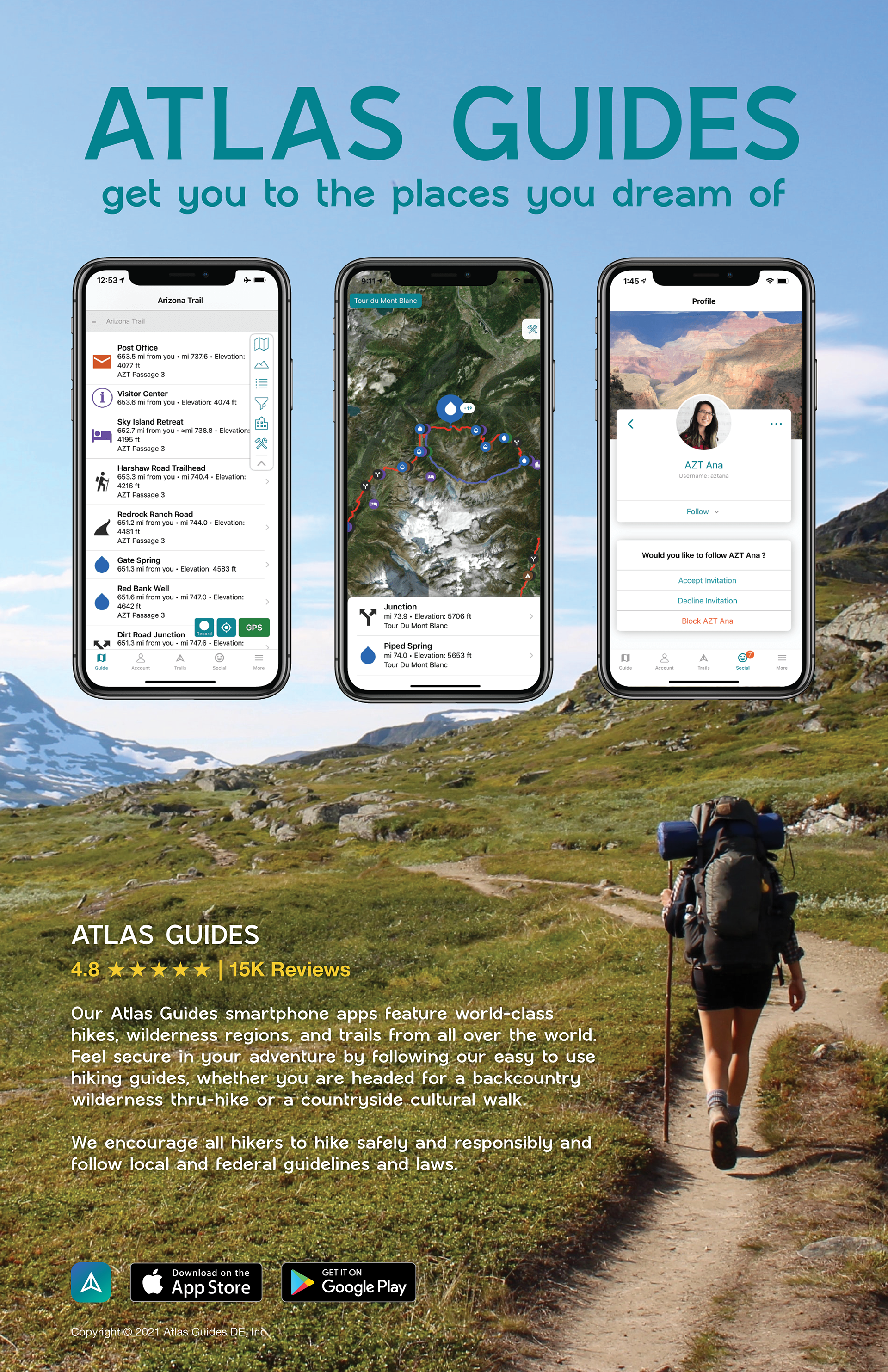
Promotional composition applying the typeface within a branded outdoor interface context. Large-scale headline typography establishes immediate hierarchy, while the integration of mobile screens and landscape imagery demonstrates how the letterforms perform within a multi-element communication system.
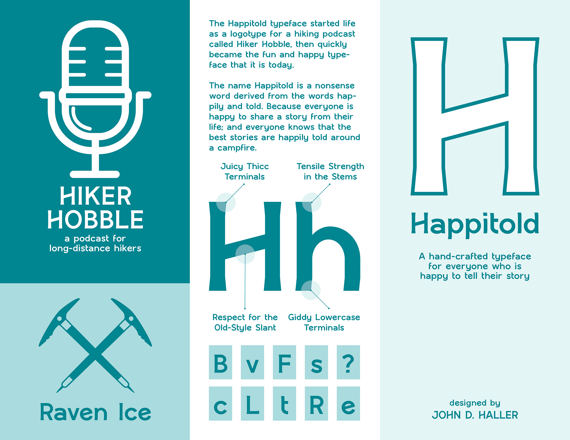
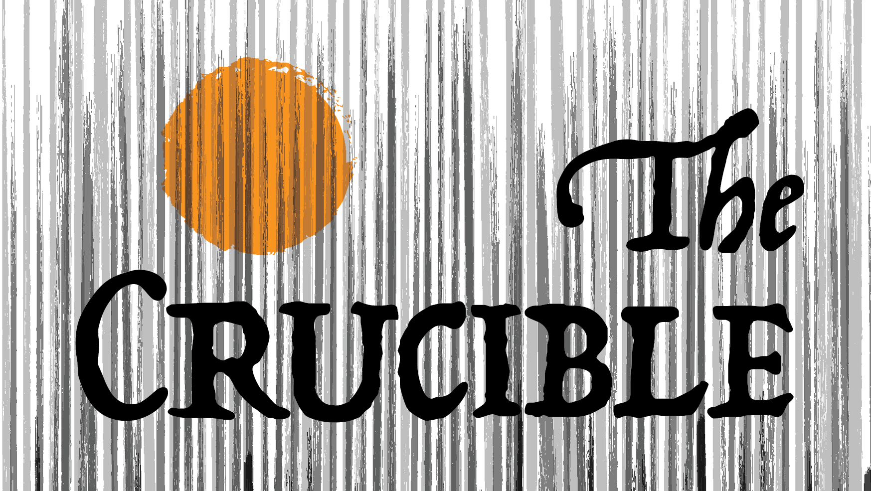
Exterior spread of the folded specimen flyer. This side combines the Hiker Hobble podcast identity, supporting graphic elements, type feature callouts, and a title panel for Happitold, establishing the tone and narrative of the typeface before the viewer opens the piece.
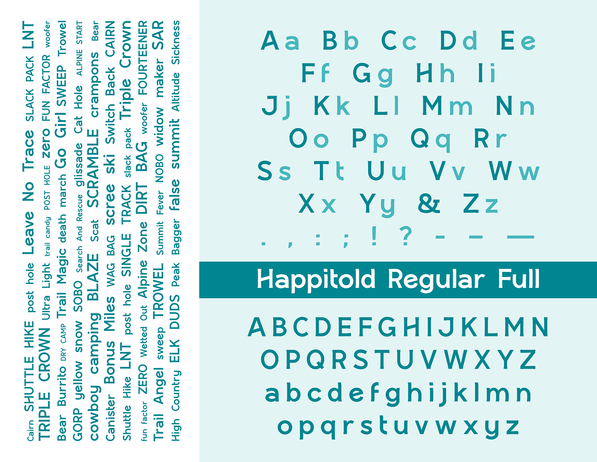
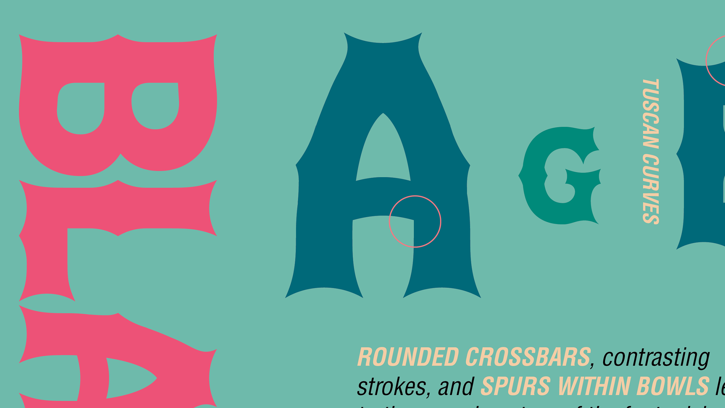
Interior spread of the specimen flyer presenting the full Happitold character set, punctuation, and word tests. The layout emphasizes alphabet coverage, stylistic consistency, and display-scale readability while showing the typeface in repeated proofing and specimen contexts.
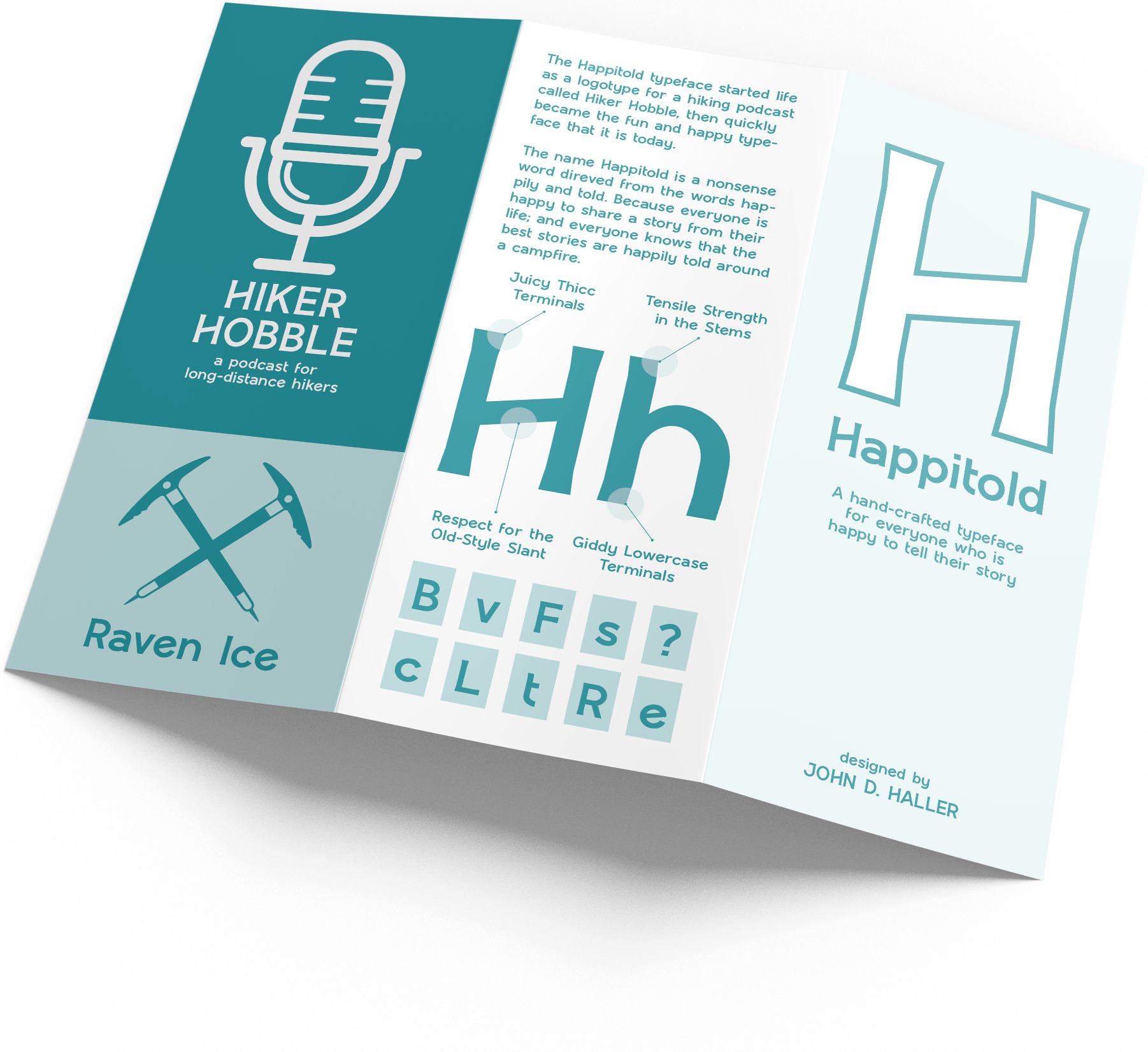
Mockup of the folded Happitold specimen flyer showing the exterior panels. The outside introduces the typeface through branding applications, a large feature letterform, and supporting identity elements tied to the hiking podcast concept from which the project originated.
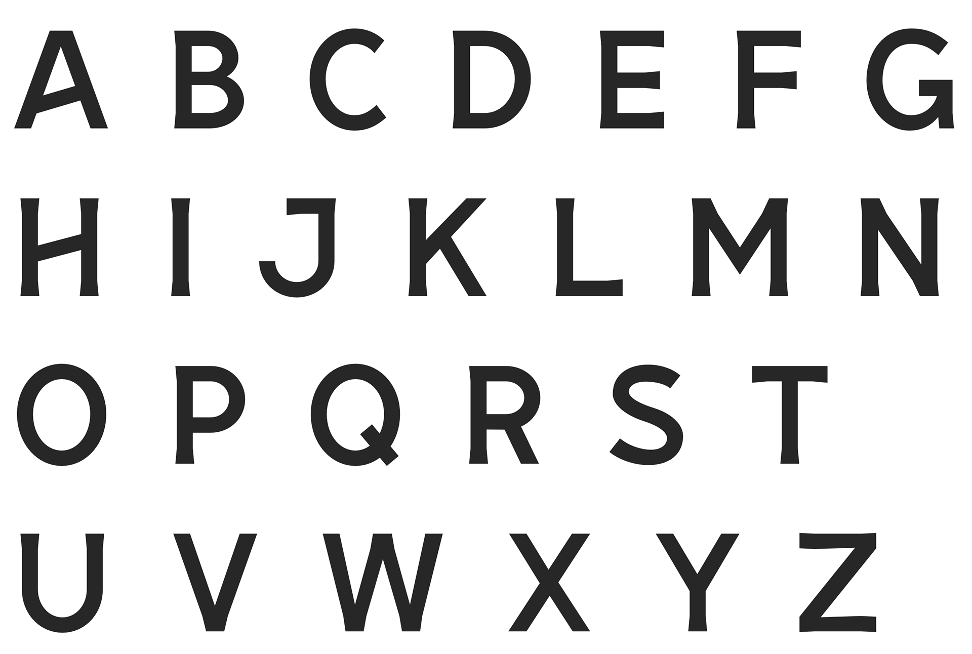
Uppercase character sheet for the Happitold typeface, presenting the full capital alphabet to demonstrate stroke structure, proportion, and consistency across the display character set.
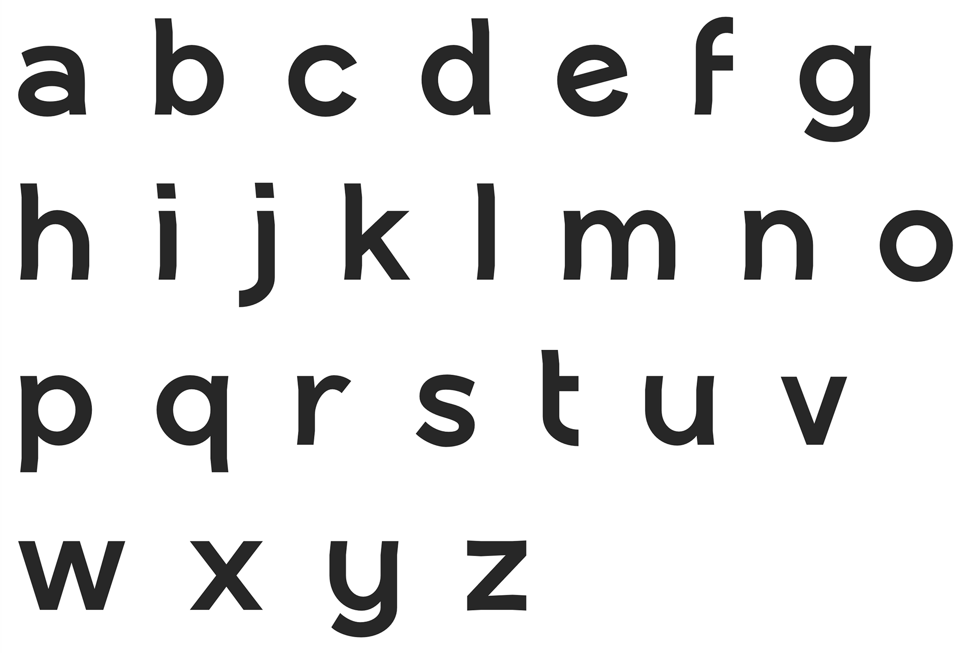
Lowercase character sheet for the Happitold typeface, showing the full lowercase alphabet and highlighting the typeface’s rounded forms, angled details, and distinctive terminal treatments.