Blaise is an all-caps display typeface developed as a formal study in expressive letterform construction, contrast, and stylistic consistency. The project explores how a limited character set can be used to build a highly recognizable typographic voice through repeated structural decisions rather than through decoration alone. Its visual language draws on pointed spurs, tapered terminals, and asymmetrical interior shaping to produce a typeface that feels simultaneously ornamental and controlled.
The design process appears to have moved from hand-drawn exploration to digital refinement, using iterative comparison to stabilize proportion, weight distribution, and internal counterform behavior across the alphabet. Several letters emphasize distinctive features such as curved crossbars, flamelike terminals, and sculpted bowls, allowing the typeface to maintain cohesion while preserving variation from glyph to glyph. The specimen materials further position the typeface as a usable communication system by demonstrating scale shifts, character consistency, and application in promotional settings.
As a portfolio project, Blaise demonstrates typographic sensitivity, disciplined form-making, and the ability to translate sketch-based ideas into a resolved display face. It shows evidence of iterative development, stylistic system building, and production-aware presentation through specimen design and mockup application. Together, the artifacts frame the project not simply as lettering, but as a type design investigation grounded in visual structure and formal decision-making.
Methods / Process Statement
Developed through hand-drawn letterform exploration followed by digital vector construction and iterative refinement. Glyphs were adjusted for proportion, stroke behavior, counterform consistency, and stylistic continuity across the all-caps set.
Developed through hand-drawn letterform exploration followed by digital vector construction and iterative refinement. Glyphs were adjusted for proportion, stroke behavior, counterform consistency, and stylistic continuity across the all-caps set.
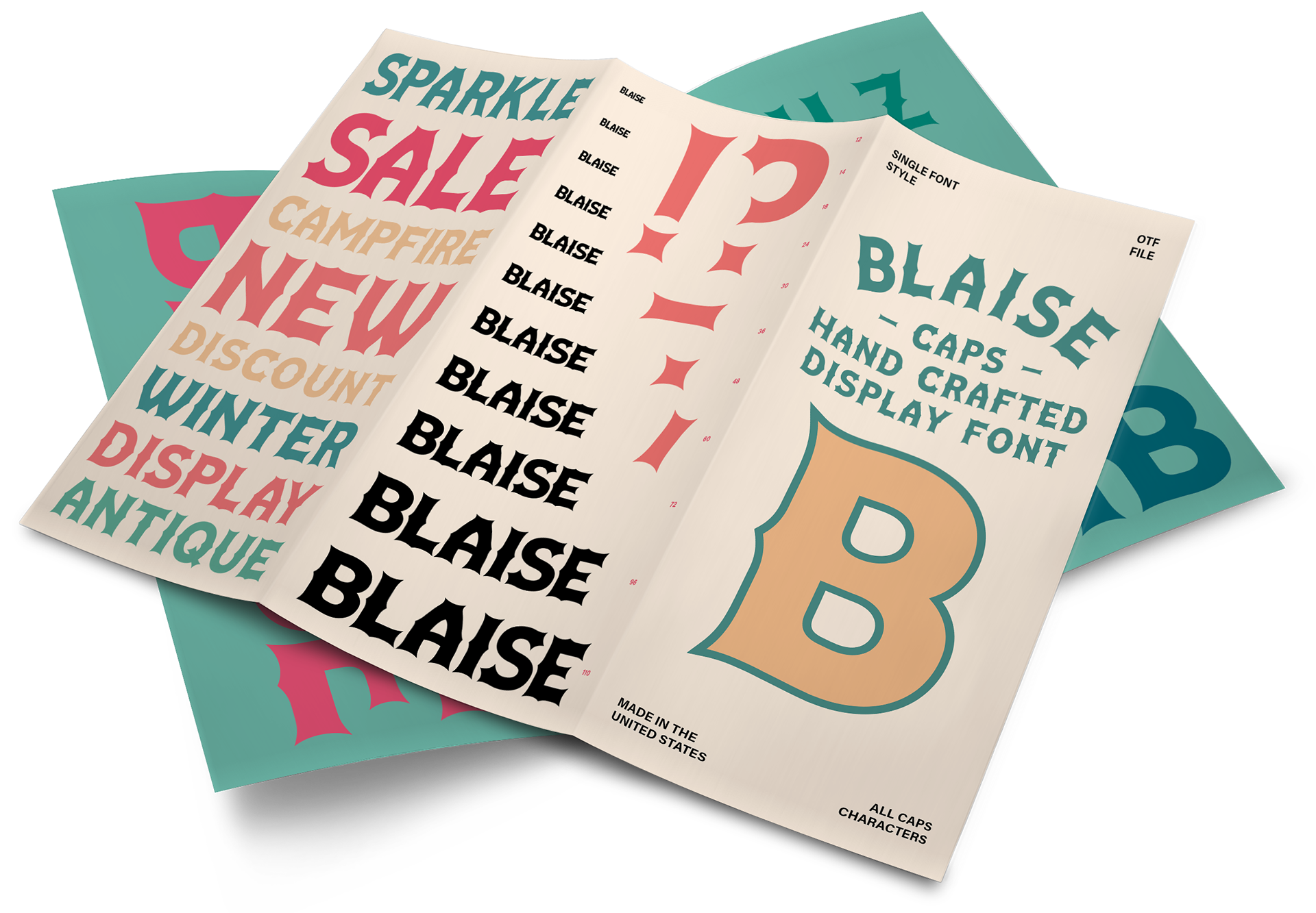
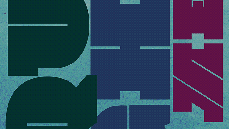
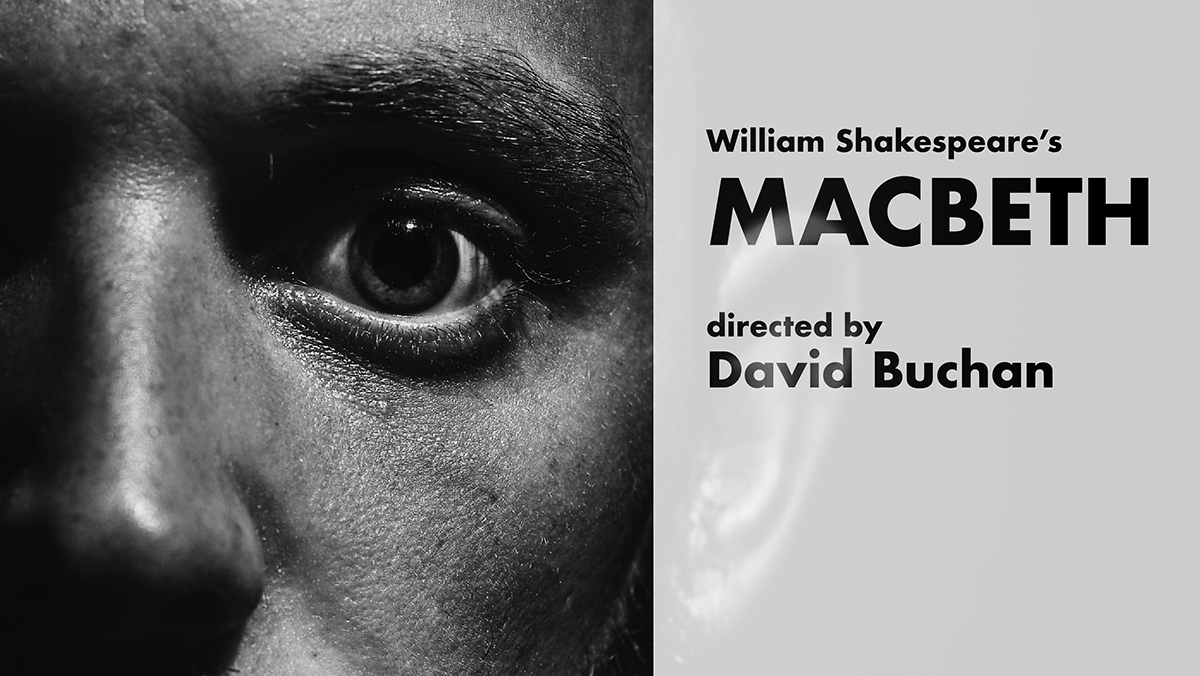
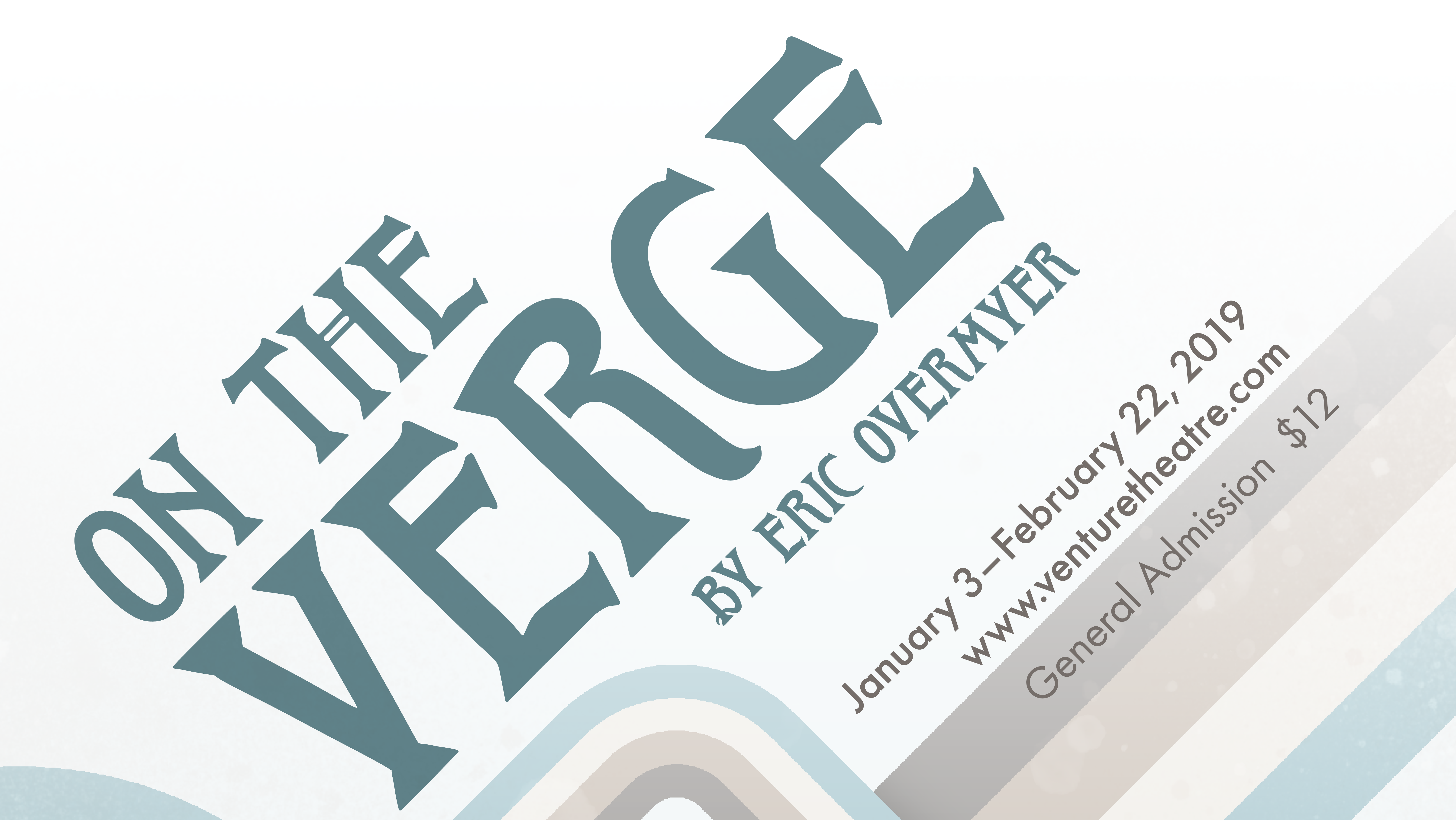
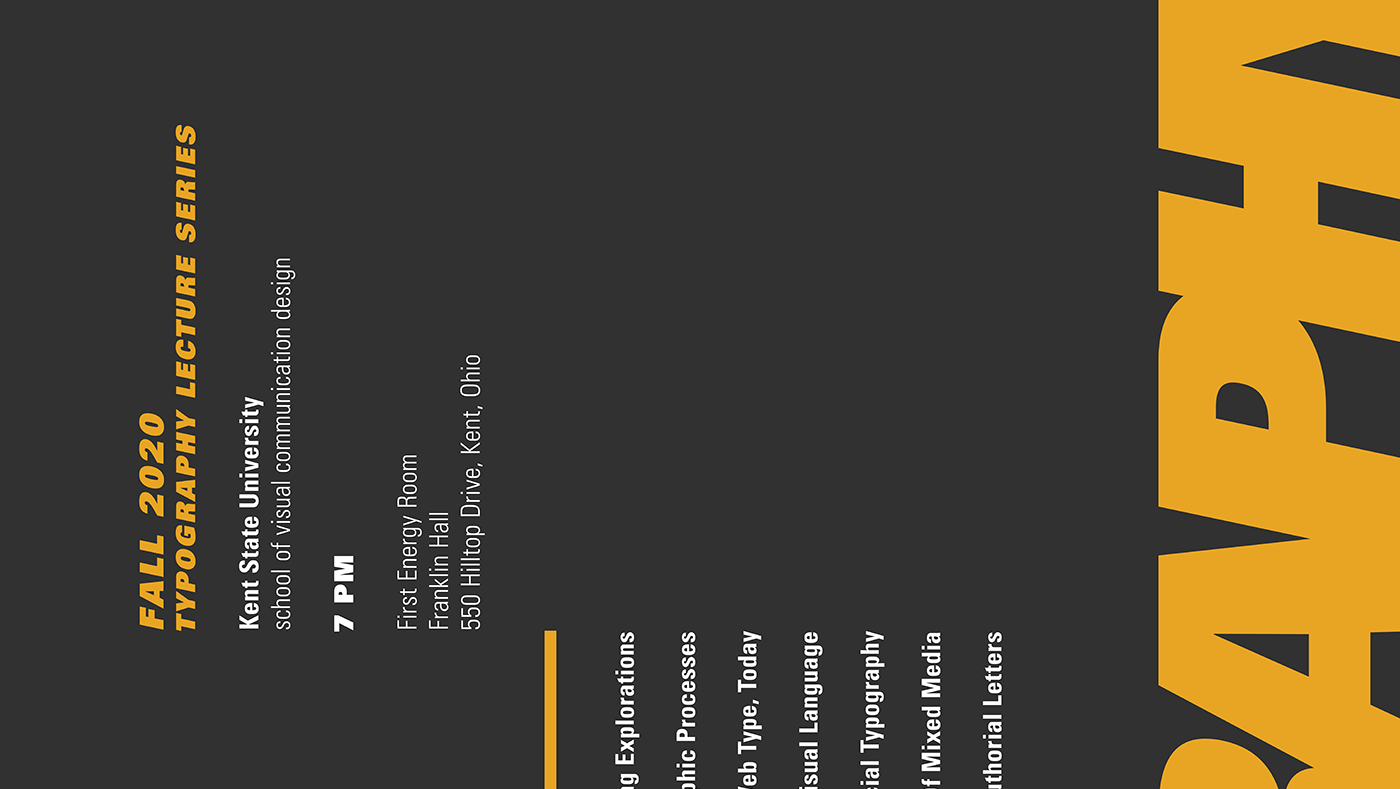
Promotional specimen brochure presenting the typeface across multiple scales and formats. The layout demonstrates how the face performs in headline applications, character display, and feature callouts, using sequencing and contrast to frame the typeface as a cohesive visual system.
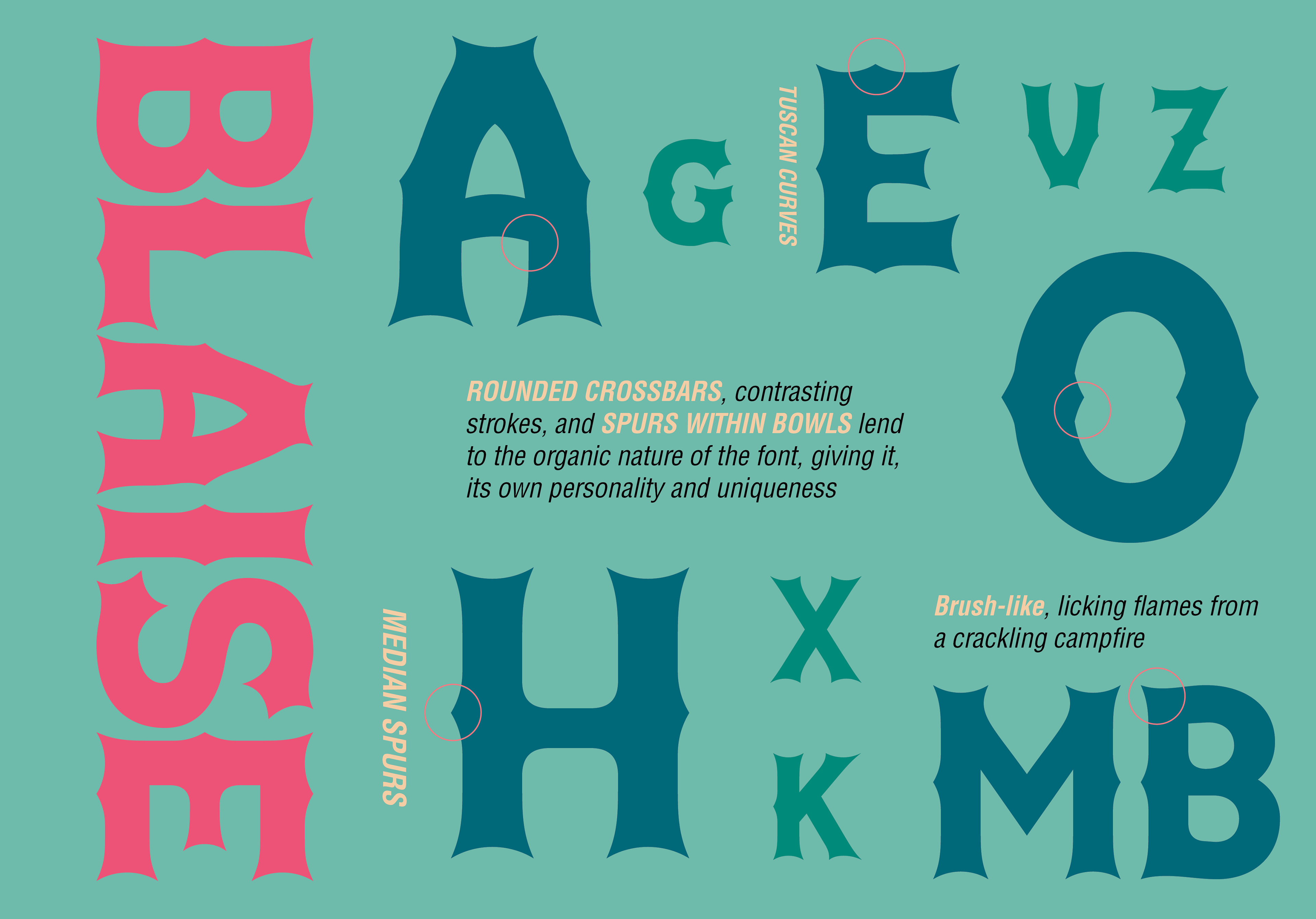
Typeface detail sheet highlighting recurring formal characteristics across selected glyphs. The composition isolates curves, crossbars, spurs, and bowl structures to show how specific construction decisions generate stylistic consistency throughout the alphabet.
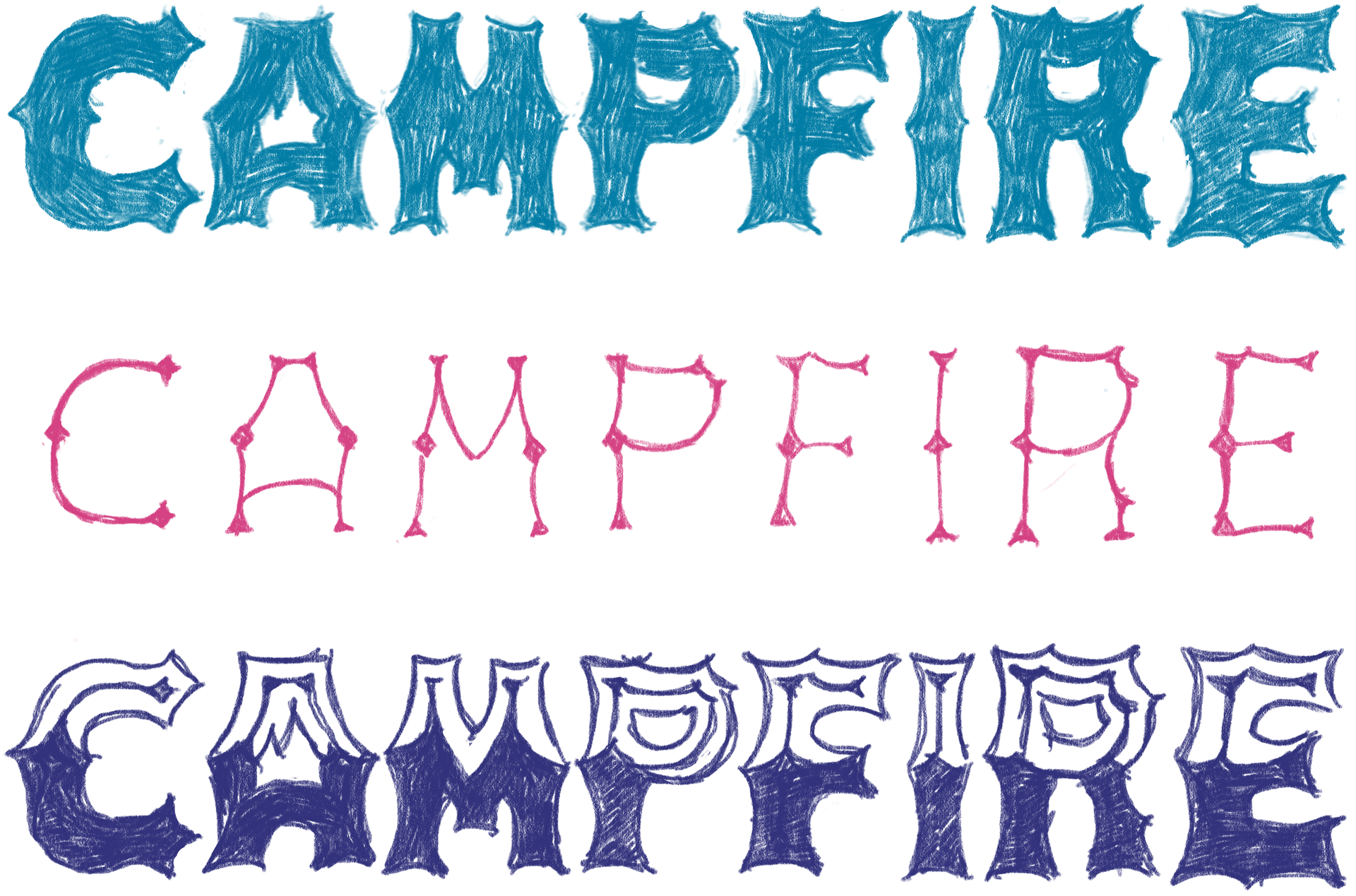
Iterative sketch studies documenting the transition from rough hand-drawn concepts to more resolved letterforms. The progression shows how structural motifs were tested, simplified, and regularized before digital construction.
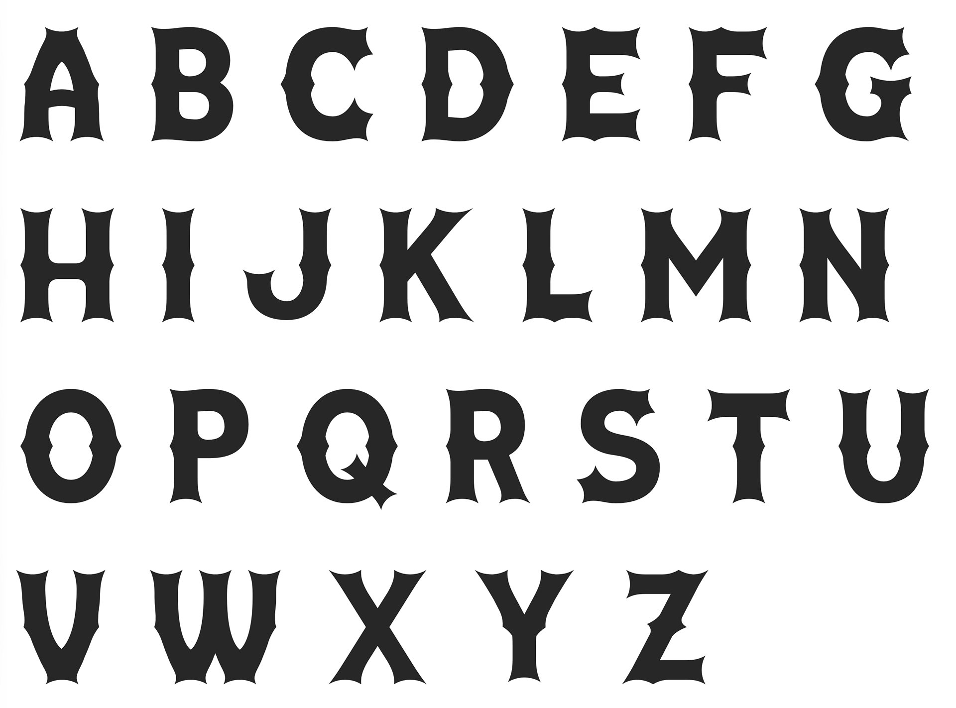
Full alphabet specimen showing the typeface as an all-caps character set. The sheet emphasizes consistency across repeated stroke logic, sculpted terminals, and distinctive interior forms while allowing overall rhythm and spacing to be evaluated at display scale.