Hiker Hobble is a display typeface developed as a formal study in typographic construction, visual character, and expressive consistency. The project investigates how letterform structure can communicate an identifiable voice while maintaining legibility across a range of scales. Rather than treating the typeface as a purely stylistic exercise, the work approaches type design as a system: individual glyphs are developed through repeatable structural decisions, then tested in words, scale studies, and specimen applications to evaluate rhythm, proportion, and consistency.
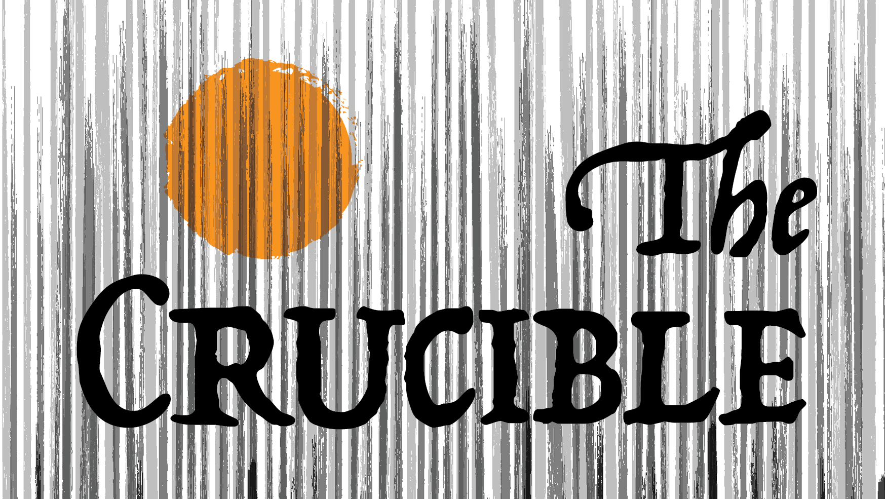
The letterforms use a sturdy, weight-bearing construction that suggests durability and motion, while subtle irregularities in stroke behavior and terminal treatment introduce a controlled sense of instability. This tension between stability and wobble gives the typeface its character and defines the logic of the system. Process drawings document the geometric and vector-based construction of individual glyphs, while specimen studies test the typeface in application, including size variation, wordmark development, and thematic pairing with imagery. Together, the project demonstrates iterative form development, typographic sensitivity, and an ability to move between micro-level letterform refinement and broader communication outcomes.
Methods / Process Statement
Designed and digitally constructed using vector-based tools. Glyphs were developed through iterative refinement of stroke structure, proportion, spacing, and internal counterform relationships, then evaluated through outline studies, size tests, and specimen applications.
Designed and digitally constructed using vector-based tools. Glyphs were developed through iterative refinement of stroke structure, proportion, spacing, and internal counterform relationships, then evaluated through outline studies, size tests, and specimen applications.
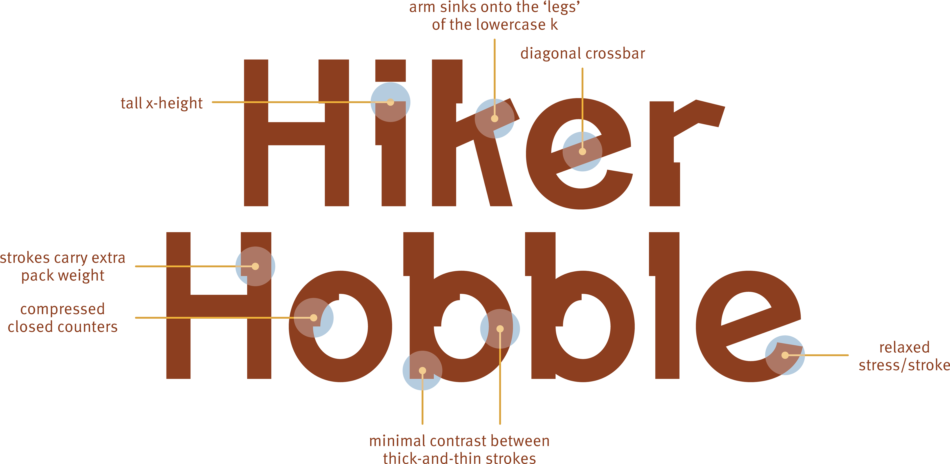
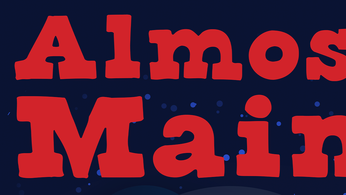
Annotated logotype study identifying the key formal traits of the typeface, including tall x-height, diagonal crossbar behavior, compressed counters, and relaxed stroke transitions that shape its distinctive voice.
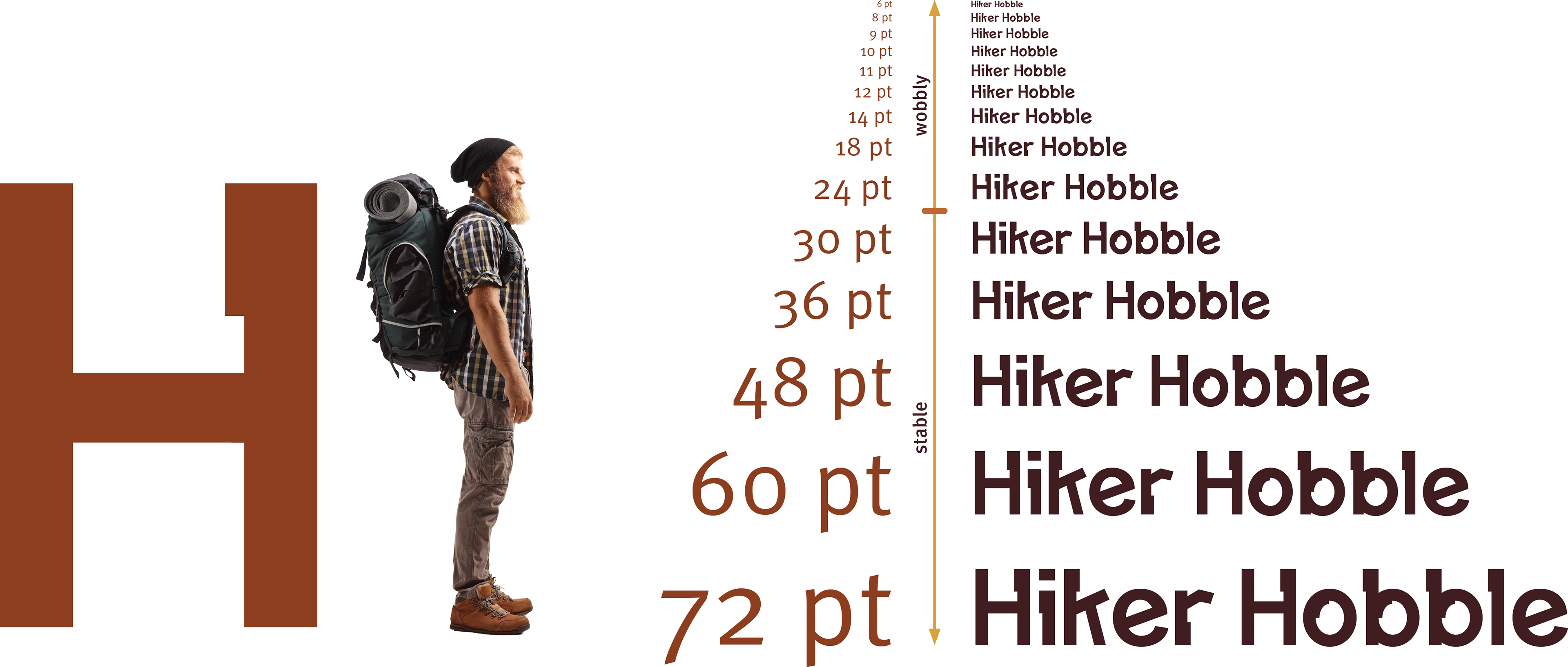
Specimen layout testing the typeface across a range of point sizes to evaluate legibility, weight distribution, and how the display character shifts from stable reading to more expressive visual presence at larger scales.
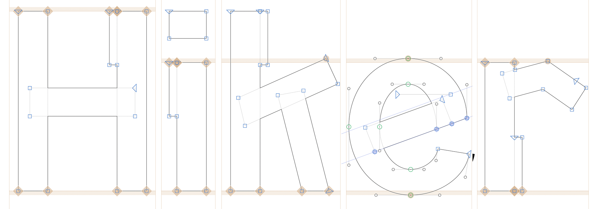
Vector construction outline for Hiker, showing anchor points, Bézier handles, and alignment logic used to establish proportions, stroke relationships, and counter structure.
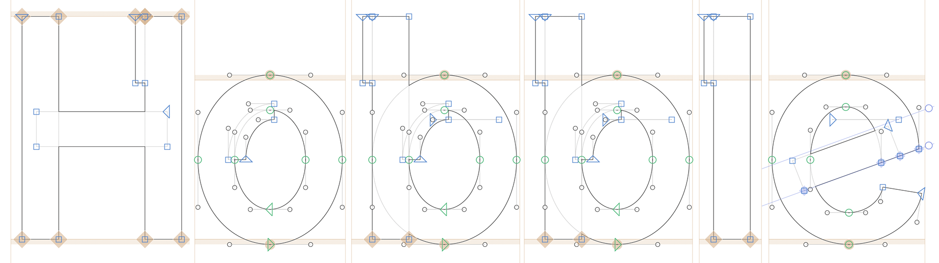
Vector construction outline for Hobble, documenting iterative adjustments to stems, bowls, terminals, and spacing to maintain rhythm and structural consistency with Hiker.